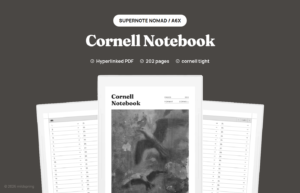
The Cornell method looks simple until you try to draw it freehand every lecture. A good cornell notes layout on an e-ink tablet keeps the cue column, notes column, and summary band in the same place on every page so your hand stops reinventing the margins.
We already have a Supernote walkthrough and a buying guide for Cornell notebooks. This post stays on the layout itself: what each region is for, how wide to make the cue column, and what changes when the page is digital.
The three parts of the page
Cornell pages split into three jobs. The main notes column holds the live capture: facts, diagrams, quotes, steps. The cue column on the side holds questions, keywords, and prompts you write after class. The summary band at the bottom forces a short recap in your own words.
That split is the whole point. During class you stay in the notes column. Later you fill cues and summary, which turns the page into a study sheet instead of a transcript dump.
Building a cornell notes layout that fits a tablet
On paper, many Cornell sheets use about a 2.5 inch cue column. On a tablet, absolute inches matter less than ratio. Too narrow and your keywords wrap into mush. Too wide and the notes column feels cramped for diagrams.
A practical digital starting point is roughly one quarter of the page for cues and three quarters for notes, with a summary band about one fifth of the page height. Landscape orientation can widen the notes column if you draw a lot. Portrait keeps the summary closer to where your hand finishes a page.
Leave a little gutter between cue and notes so ink from one side does not visually collide with the other. On e-ink, low-contrast lines help the structure stay present without shouting over your handwriting.
How the layout behaves on e-ink
E-ink pages do not flip like paper, so the summary band has to stay easy to reach without tiny targets. Fixed PDF templates help because the lines do not drift when you zoom. Native templates work too if the app keeps the same Cornell background on every page of the notebook.
Linking changes the method in a small but useful way. You can jump from an index of subjects to the first empty Cornell page, then back to a weekly review. Paper Cornell binders needed tabs and fingers for that. Digital Cornell can use a contents page.
Refresh rate and pen lag matter less than whether you can see all three regions while writing. If you pinch-zoom into the notes column forever, the summary stops doing its job.
A simple session flow
- During the session, write only in the notes column
- Within a day, add cue questions that your future self can answer from memory
- Fill the summary in two to four sentences, not a second transcript
- During review, cover the notes column and answer the cues out loud
If you fill cues during the lecture, you are usually multitasking the wrong stage. Capture first. Process later. The layout is there to protect that order when the room is moving quickly.
Common layout mistakes
People turn the cue column into a second notes column and lose the question format. Others skip the summary for weeks, which removes the pressure that makes Cornell useful. Some shrink the summary into a decorative footer that cannot hold a real recap.
Another digital-only mistake is zooming so far in that you never see the summary band while writing. Keep enough of the page visible that the three regions stay honest. Also avoid turning the cue column into decorative stickers that leave no room for questions.
Choosing a template vs drawing your own
Drawing Cornell lines by hand on every page burns time and creates crooked columns. A template is worth it if you take notes more than a couple times a week. Drawing once as a custom native template can work on devices that support it. PDFs win when you want the same layout across brands.
Subject pages versus continuous scrolls
Some students keep one continuous Cornell notebook per class. Others start a fresh page per lecture. Continuous books are easier to search by date. Per-lecture pages are easier to link from a weekly review. Either works if the three regions stay consistent.
On tablets we prefer per-lecture pages with an index because linking is cheap and scrolling a giant continuous file is not. Paper users often prefer continuous to avoid wasting half-blank sheets. Match the medium.
Using Cornell for meetings not just classes
The same layout helps in work meetings. Notes column for discussion, cue column for decisions and owners, summary for the email you send afterward. People who say Cornell is only for school usually tried it without the later processing step.
Keep meeting Cornell pages shorter. A summary that becomes the action email is enough. You do not need a study-style self-test unless you are learning a dense topic on purpose.
If your meetings are mostly task assignment, a dedicated meeting notebook may beat Cornell. If your meetings are mostly learning and decisions mixed together, Cornell still earns the page.
Review days that make the layout pay off
Cornell only compounds if you return. Put a short review block on your calendar twice a week. Cover the notes column with a blank sheet or your hand, answer the cues, then skim summaries for the themes that keep repeating.
On many tablets you can copy a completed Cornell page into an “exam review” notebook. That beats rewriting notes into a second notebook. The layout already separated the ingredients. Review is assembly.
If you skip review for a month, shrink the cue column goals. Write three questions per lecture instead of ten. A smaller practice you repeat beats a perfect page you abandon.
For a deeper device-specific walkthrough, see our Cornell method on Supernote guide. For picking a notebook shape across tablets, use Cornell notes digital. And if you want the layout ready to import, the Cornell notes digital notebook has the cue column, notes area, and summary band on every page, with a linked index.