Most people asking about bullet journal page style already know the method. They are stuck on the page under it: dotted, lined, blank, or grid. The short answer is that dotted pages fit the classic BuJo workflow best, while lined and blank still win for specific kinds of writing.
I sell templates for e-ink tablets, so I see this choice play out on Supernote, reMarkable, and Kindle Scribe every week. Paper rules still matter on a screen because they change how fast you can build a daily log, a collection, or a messy sketch without fighting the ruling.
What a bullet journal asks of the page
Bullet journaling is a mix of short logs, boxes, trackers, and freehand diagrams. Rapid logging wants a soft grid you can ignore. Habit trackers want easy columns. Collections want room to grow sideways. That is a different job from a meeting notebook that stays in neat paragraphs all day.
The original Ryder Carroll practice never required one brand of paper. It required a system you would actually reopen tomorrow. Ruling is part of that friction budget. If the page fights the marks you make most often, you stop migrating tasks and the notebook dies.
If you want the wider ruling comparison across blank, lined, dot grid, and grid, we already wrote that out in our blank vs lined vs dot grid guide. This post zooms in on BuJo tasks only.
Choosing a bullet journal page style for dailies
Daily logs are the heartbeat. Most entries are a few words with a bullet, a date header, and the occasional small box. Dotted pages support that rhythm because you can align a header when you want structure, then ignore the dots when you are only dumping tasks.
Lined pages pull your eye into full sentences. That is helpful for diary-style days and annoying when you only needed three tasks and a grocery line. Grid pages make tidy tables, but rapid logging can feel stiff when every mark wants to sit on an intersection.
On e-ink, I still start customers on dotted for the daily unless they already know they write long morning pages. You can always add a lined section later. Starting lined and wishing for dots usually means redrawing trackers that never quite square up.
Dotted pages for the classic setup
Dot grid is the default in most paper BuJo communities for a reason. The dots give you alignment when you need a box or a calendar, then disappear when you are only writing a few bullets. On e-ink, the same thing happens if the dots are light enough that they do not compete with your pen strokes.
Monthly calendars are easier to square up on dots. Trackers that need a 7-column week stop looking drunk. Collections like reading lists or project dashboards can grow in either direction without inventing a fake margin.
The tradeoff is handwriting comfort on long prose. If your writing drifts downward across a wide tablet page, add a faint lined template for reflection pages only. Keep the logs dotted so the system still feels like one notebook.
Lined pages when the journal is mostly writing
Lined ruling is better when your bullet journal is really a diary with task bullets on the side. Morning pages, therapy notes, and long debriefs sit more naturally on lines. You spend less energy keeping rows level, which matters when you are already tired.
The cost shows up in trackers and calendars. Drawing a habit grid on lined paper means fighting the horizontal rules or ignoring them. People who stay on lined pages for BuJo usually keep trackers simple: short lists, checkboxes in the margin, and fewer full-page calendars.
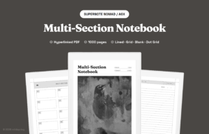
A hybrid that works well digitally is lined dailies for writers who still want a dotted monthly and tracker pack. Hyperlinked PDFs make that mix easy. Native apps need either multiple notebooks or per-page template support.
Blank and grid as specialty tools
Blank pages are great for mind maps, sticker layouts, and messy planning sessions. They are weak for daily logs because your bullets wander and the page looks unfinished even when the work is done. I treat blank as a collection page, not as the home for every day.
True square grid is stronger for tables and technical sketches than for classic rapid logging. Engineers and designers who BuJo on grid often want measured boxes more than soft guidance. If that is you, grid is fine. If you want the standard BuJo look, dotted still feels closer.
How this plays on e-ink tablets
On a digital tablet you can mix page styles inside one notebook, which paper cannot do as easily. A practical pattern looks like this:
- Dotted for index, future log, monthly, and daily logs
- Lined for long reflection entries
- Blank or grid for maps, wireframes, and one-off collections
Hyperlinked PDF templates make that mix easier because each section can open on the ruling you picked. Native notebook apps usually lock you into one background for a whole notebook unless the app supports per-page templates.
Pen tip size changes the feel too. A thicker tip on a dense dot grid can muddy the page. If your dots feel noisy, lighten the template or drop to a wider spacing rather than abandoning dotted entirely.
A simple way to choose
If your week is mostly bullets, dates, and small trackers, start dotted. If your week is mostly paragraphs with a task list on top, start lined. If you redraw systems every Sunday and care about square tables, try grid. Keep blank in the mix for collections that refuse to sit in rows.
None of this is a personality test. It is a match between the marks you make most often and the guidance the page gives you. Change the ruling when the work changes, and do not wait for a new year to migrate.
Examples from real weekly use
A software lead I talked to keeps dotted dailies during sprint weeks, then flips to lined pages on Friday for a longer retro. The ruling change marks the mode change. Another customer teaches high school and stays dotted all year because seating charts and grade trackers need soft columns without full grid noise.
I also see writers abandon BuJo on grid after two weeks because every sentence feels like it should end at an intersection. They were not failing the method. They picked a page built for tables. Swap the ruling and the same person suddenly migrates tasks again.
Migrating without rewriting last month
If you already filled fifty pages on the wrong ruling, do not recopy them. Start a new section or notebook with the better page style and leave the old pages as an archive. On a tablet that can mean a new PDF section or a new native book titled with the month you switched.
Carry forward only open tasks and active collections. The point of bullet journaling is current work, not a museum of prior layouts. A clean cut beats a perfect historical record.
If you want a ready-made BuJo layout on e-ink, look at our bullet journal templates. They are built for the same weekly rhythm described here, with navigation that keeps daily logs from getting buried.