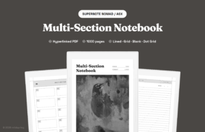
If you have opened a well-made notebook PDF on a Kindle Scribe, reMarkable, or Supernote, you may have noticed a small row of links at the top of each page that shows where you are. Those are pdf breadcrumbs, and they are the quiet feature that turns a flat document into something you can actually navigate without scrolling.
This is a short walkthrough of what they are, how they work, and why they matter more on an e-ink tablet than on a phone or laptop.
What pdf breadcrumbs actually are
Breadcrumbs are a trail of links that shows the page’s place inside a larger structure. On a website you see them as Home > Category > Page. In a PDF notebook the same idea is rendered as small tappable text at the top of each page, usually pointing to the cover, the section index, and the current page or subsection.
Each part of the trail is a hyperlink to a named anchor inside the same PDF. Tap it on your e-ink device and you jump straight to that page, no scrubbing through the page slider.
How they work under the hood
PDFs support internal links the same way HTML does. Each page is given an ID (or named destination), and links elsewhere in the document point to that ID. A breadcrumb is just a row of those links, repeated on every page.
- Cover link sends you to page one.
- Section link sends you to that section’s index page.
- Current page link is non-active, or styled to show you are already there.
Most e-ink devices honor PDF internal links, so the breadcrumbs work without any special app. If your reader supports outlines (the sidebar TOC), good breadcrumbs complement that, they do not replace it.
Why they matter on e-ink tablets
On a phone, scrolling is cheap. On an e-ink tablet, every refresh costs a beat. That is why navigation that takes one tap beats navigation that takes three.
- One tap instead of slider scrubbing. Jumping from page 84 back to the cover via slider on e-ink is slow. A breadcrumb tap is instant.
- Less reliance on the device TOC. Some readers hide the outline behind a menu. Breadcrumbs are always visible.
- Visual orientation. Even without tapping, the trail reminds you which section you are in.
What good breadcrumbs look like
Not every trail is useful. A well-designed one has a few things in common:
- Short. Two or three steps maximum. Cover, Section, Page is enough.
- Consistent. Same position and same labels on every page. Your eye should not have to hunt.
- Tappable target size. Stylus on e-ink is precise, but if the link is six pixels tall you will miss it. Aim for at least a tall touch line of text.
- Subtle. Light grey, small font. Navigation should not compete with your notes.
Common mistakes to avoid
- Too many levels. Cover > Year > Quarter > Month > Week > Day is six taps of nothing. Trim it.
- Broken links. A breadcrumb that points to a deleted anchor sends the reader to page one, or nowhere. Test every link after export.
- Decorative arrows that look clickable. If the separator is a chevron, readers will tap it. Make it visually obvious which parts are links.
Breadcrumbs are one piece of a hyperlinked PDF notebook. See them in a real file on the Multi-Section Notebook for Supernote, or browse every template in the shop.